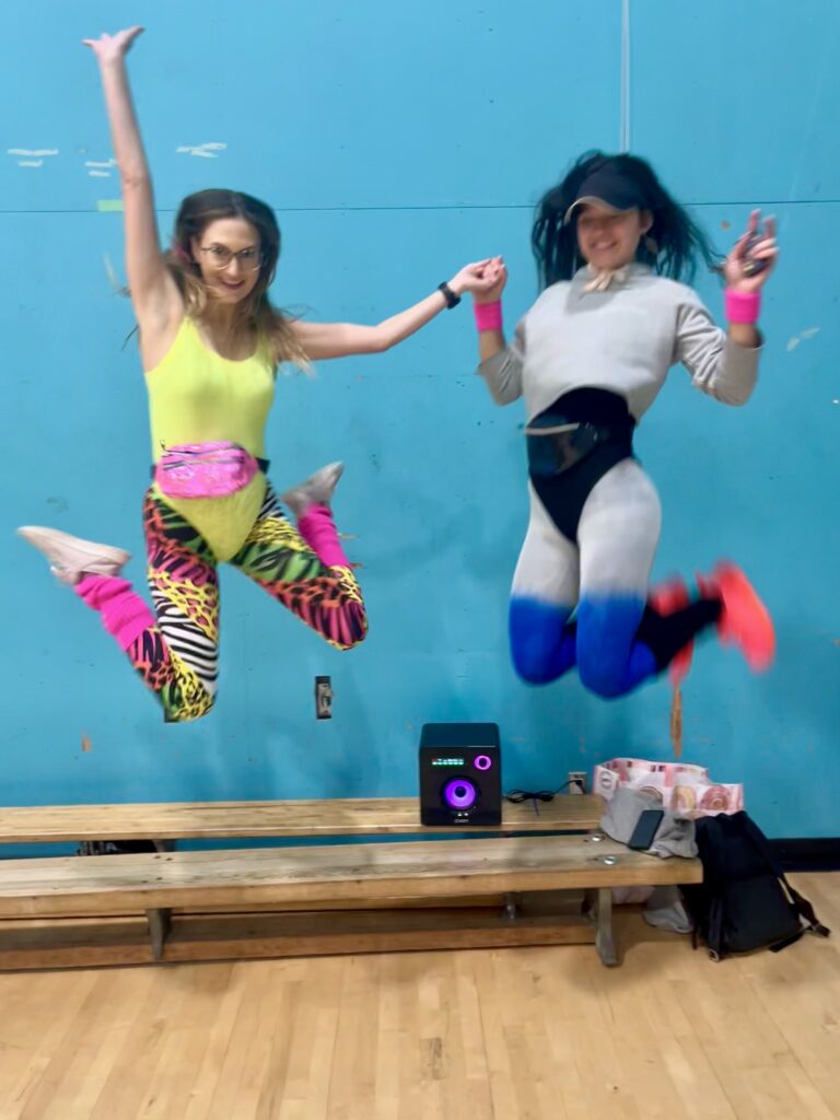
For our PE class at UVIC, we were tasked with creating a warm-up as part of an assignment. My partner and I chose to do a dance warm-up using the “Cha Cha Slide” and “I Like to Move It.” We combined dance moves with exercises to get the entire class involved, and we even dressed up in ’80s costumes to make it more engaging. It turned out to be a lot of fun because it wasn’t the typical warm-up; the music and lively atmosphere made it exciting for everyone.
Kathryn and Hanne Rocking ’80s Vibes for Our PE Warm-Up Session

I recorded the session on my laptop, but we faced a few challenges:
- We didn’t capture the whole class or ourselves clearly.
- The video and sound quality were poor.
- There was a risk of someone accidentally knocking over the laptop (luckily, that didn’t happen!).
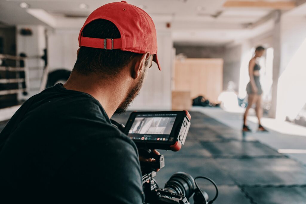
For next time, here’s how we plan to improve. We found some ideas from Columbia University’s Video Production Best Practices, which include
- Use a tripod for stability: Ensures a stable, elevated view and prevents risk of the device being knocked over.
- External microphone for sound quality: Improves clarity by reducing background noise.
- Designated camera operator: Helps capture different angles and close-ups for a more dynamic recording.
- Use multiple cameras/devices: Captures various perspectives, making the final video more engaging.
- Consider lighting: Ensure good lighting for clear, high-quality footage. Use portable LED lights or ring lights if needed.
- Use a gimbal for smooth shots: Helps prevent shaky footage if the camera operator is moving.
- Get interactive feedback from participants: Include short interviews or feedback clips to make the video more engaging and showcase the experience.
- Post-production editing: Use software like iMovie or Adobe Premiere Rush to enhance video, add transitions, and adjust sound levels.
Upgrading to a High-Quality Video Recorder for Better Footage

What a great photo! It sounds like the warm-up activity went very well and was successful. You seemingly included an aspect that every student would enjoy to one extent or another. I appreciate that you have the effective elements of the lesson but you also have the areas in which you could improve for the next rendition. That is a conclusive sign that you are and will be a wonderful teacher.
For your blog post to be more inclusive, I wonder about creating a more significant contrast between your text colour and the background colour. This would help people who have eyesight challenges to be able to read your content. I find the pictures very stimulating and enjoy your use of them! Perhaps in the future a descriptive text could be used to add accessibility for people who are visually challenged.
Overall, I appreciate your self-awareness and your pure devotion and excitement to creating fun and engaging lessons. Well done!